Colour. It affects everything around us: our mood, our living space, whether we are attracted to something or just walk on by. It can tell us whether something is expensive, affordable or cheap. A difference shade can even indicate whether we should wait or go.
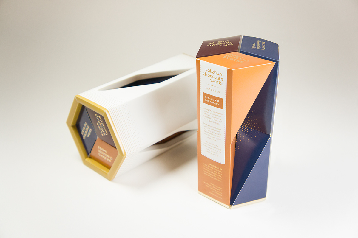
Colour is especially important when it comes to paper and trends in packaging. We choose colours to represent our brands that reflect the personality of our brand or denotes the value of a product or even to deliver a subliminal message to the end user before they’ve even turned a page or opened a box. Take the Tiffany box for example, which in 1837 followed the turquoise colour trend set by the rich and famous at the time. “Tiffany Blue” is now immortalised in Pantone Blue 1837, and a true example of how a colour can become an internationally recognised symbol of elegance and sophistication.
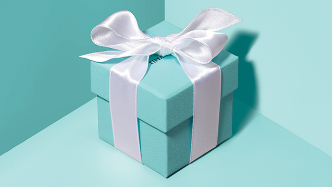
Image Source Adweek.com
We’ve trawled the internet looking for some of the best blogs on colour, trends and colour forecasting and came up with a list of our five favourites for you to enjoy.
Color Matters
This whole website is dedicated to colour – discussions on colour theory, trend forecasting, the science behind colour and psychology. One article in particular that we wanted to share was one that explains colour theory really well so it’s a great place to start.
Graphic Mama
Graphic Mama is actually a company that creates and sells vector graphics such as cartoon characters, themed graphics and animator puppets for websites and videos. But they also have a fantastic blog with articles like logo design trends, colour trends, powerpoint tips, presentations tips and tricks, landing page design examples and more. It’s a really inspirational blog and we’ve chosen an article here to show you on colour from their site.
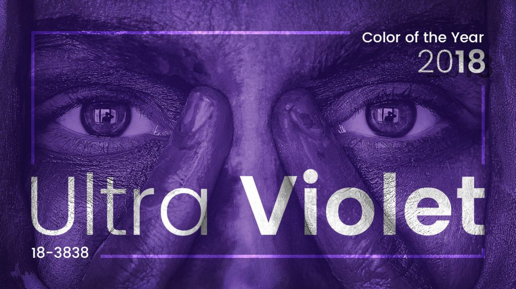
Image by Graphic Mama
Ideal Home
You might be wondering what has a home interiors publication got to do with paper and why has it made our top 5 blogs on colour? Well this particular publication is choc full of articles on colour, trends, home and lifestyle. All of which influences our choices when it comes to designing packaging and products addressing different segments. We’ve picked up an article on here detailing design and colour trends for 2018 which we thought you’d be interested in reading.
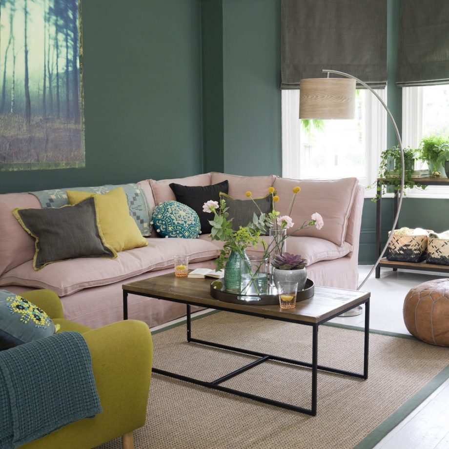
Image by Home Decor Trends
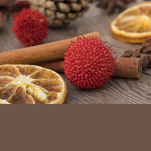
Digital Arts Online
We love this online publication – they’re not stingy when it comes to articles of interest, they elaborate and explore and give detailed analysis of their subjects as well as really useful tutorials for graphic designers. We love this article from them on the Pantone colours for Spring 2018 which will feed into trends for the rest of the year.
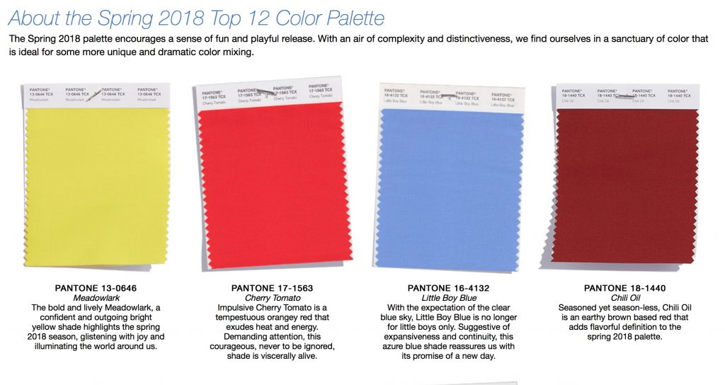
Image by We Fell In Love
WGSN
Ok so those of you who are in the know, know that WGSN are the world authorities on trend forecasting for colour across fashion, interiors, packaging and printing markets. No where else in the world will you see such in-depth analysis and trend forecasting. But beware, they run a subscription model which is not for the fainthearted. Fashion houses and interior décor companies, Universities and manufacturers who rely on getting their collections bang on trend rely on WGSN and therefore they have a captured customer base who are willing to pay. However, they issue sample reports on trends and they give you a glimpse of what trends are coming. We’ve found a great one on packaging that we thought was worth entering your email address to get your hands on it- and here it is:
https://www.wgsn.com/en/industries/paper-packaging/
Previous post
Top 5 Blogs to Follow on Colour
Next post
5 Best Blogs on Packaging Design